SRM Architects + Urban Designers
Brand Identity
SRM Architects, a full service architectural firm with southwestern Ontario roots that date back over 60 years, wanted to mark their merger with Toronto and area agency Michael Spaziani Architect Inc. (MSAi). This merger would further expand on a breadth and depth of services to include high-quality urban design and master planning for their valued and longstanding clients. The name evolution to SRM Architects + Urban Designers was the first step in announcing this growing venture, opening the door to a new brand identity opportunity.
SRM Architects + Urban Designers needed a visual identity that of course spoke to the modern aesthetic and minimalist sensibilities that typify most architectural firms, but with the added human elements of pragmatism, practicality and approachability that permeates all levels of their principled service offering. This was a chance to commensurate their identity with a strong history of meeting deadlines, maintaining excellent communication, truly understanding their client's needs and aspirations, all while maintaining sensitivity to their budget and schedule – things they felt truly set them apart from the rest.
A group of typographic glyphs or icons with a fresh and distinct colour palette emerged as the solution that would not only anchor the identity deeply in its modernist roots, but also represent a refreshed expression signifying their history and expansion of integrated services along with their passion for improving the ways people live and work in spaces, while moving through the spaces in between.


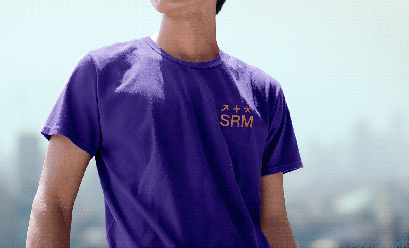
Icons
Typographic symbols that succinctly represent "architects + urban designers" while overlapping many aspects of SRM core values.